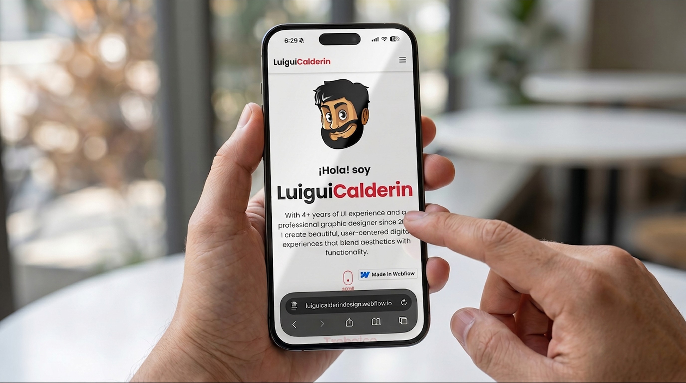
From a gallery of screens to a portfolio of decisions
A web portfolio made to show design teams and potential clients several of my projects and my career as a designer. In this case study I explain how I went from a showcase of screens with little context to a website of my own, where I document my decisions.
01 - The problem
Choosing between updating and migrating
02 - Hypothesis
A hypothesis based on criteria
I set a few criteria to narrow down which platform to choose. I kept in mind things like freedom to customize, my own information architecture, solid performance, reliable responsive design, the learning curve, low-code or no-code, and two clear constraints: a limited budget and not much time.
All of this comes form a hypothesis: A portfolio with its own domain, information architecture and structure leaves a better impression on design teams and clients than a template or a portfolio on a borrowed channel. This hypothesis could only be confirmed or knocked down once my portfolio was live and I had early feedback from fellow designers who work on design teams, —part of my target audience.
After some very quick research online, reading forum comments and blogs reviews about portfolio platforms, and factoring in the acceptance criteria I´d set, it came down to Framer and Webflow. I went with Webflow because I’d already tried it out a few years earlier. With that settled —for now— I started thinking about how to design the first sketches for my portfolio.
03 - Researching competitors
Getting to know the people who solved the same problem
Before thinking about the first sketch, it needed to run a quick benchmark of the design market. I researched portfolios competing in my own field by going through platforms that rate websites —Awwwards, for example. The ones that solved the same problem best became my references, among them the site of David Rodriguez, a product designer. Once I had a clearer idea, l finished fleshing it out with AI — specifically Figma Make— by asking it to design a portfolio from a set of instructions:
Use red, white, and black.
Add the logomark I’ve been using as my personal brand.
Lay it out following the sections my references use: a short intro, about me, career, skills, projects and how to contact me.
Don’t copy the content of these portfolios; just use them as references.
With that base in place and several animations ideas from Figma Make, I had “my first high-fidelity mockup” to start designing.

Figma Make with the instructions for building the portfolio.
What I did with AI
I defined the base, the animations, and the visual style of the portfolio using Figma Make.
What I did manually
I reorganized the hierarchy, adjusted the content, and redesigned the whole portfolio without touching the visual style.
04 - Design process
Bringing order to the website with a design system
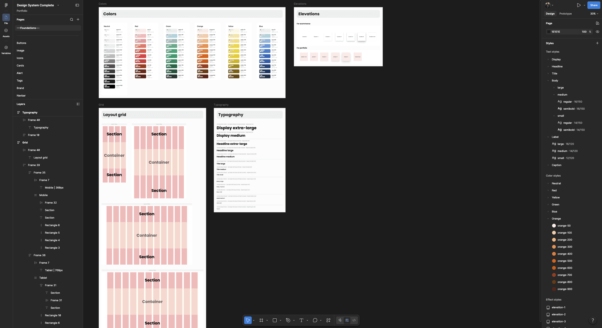
Foundations defined for the portfolio.
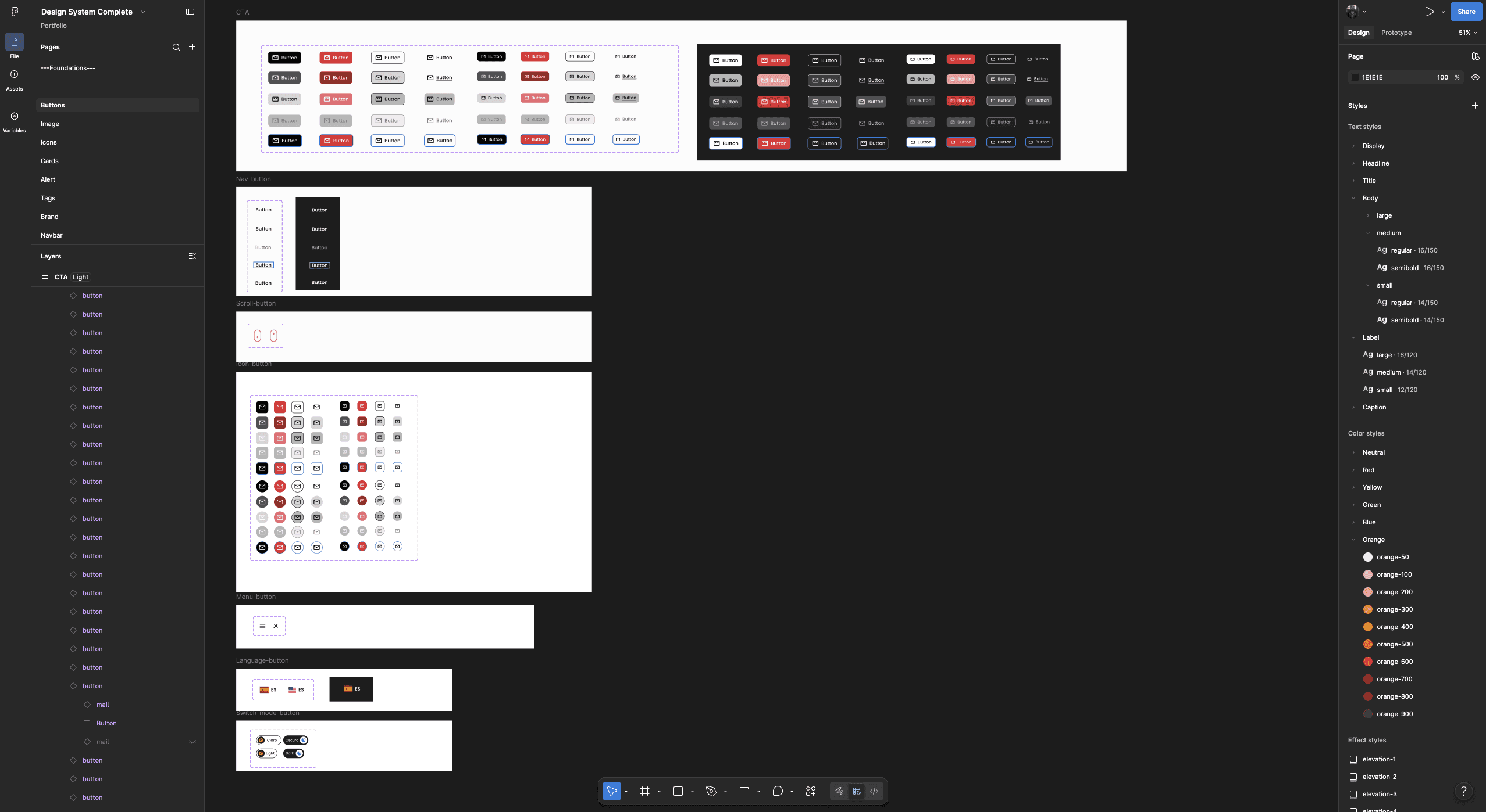
Button components.
From variables to tokens
Building the portfolio led me to make a series of changes, among them the main colors I’d defined; There would no longer be three but two: white as the primary, red as the secondary, and black became the primary color in dark mode. Once that was clear, defining the primitive colors was the first step.

Primitive color tokens — the base of the system.

Semantic color tokens.
Figma lets you use colors as styles or as variables, but you can use both at once by linking a color variable to a color style, as in the example in the image. This avoids the double work of editing in both places. And as a best practice, if a portfolio that’s already built defined its colors from styles, deleting them isn’t the right move —linking them to variables is.
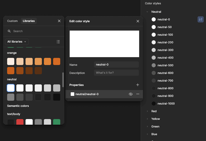
Process of linking color variables to color styles.
Dark mode
Dark mode is good accessibility practice because it lets the user reduce eye strain in low-light environments and when reading long-form content. The first step is defining the semantic color tokens in the design system. Then, in the design and build of the site, you set it up so the user can switch between light and dark mode as often as they want with a toggle.

Home page of the portfolio’s first version, in light mode and dark mode.
Documenting the components
This portfolio is not a large product that warrants documenting absolutely everything. This design system exercise its just meant to show my process for creating one, and for the documentation I only worked with the button component, changing how I built it: I used Figma MCP with Claude.
The first version of the documentation for this component is just a first pass at the instructions, references and restrictions I gave Claude, which I kept refining until reached a result that covered the basics of documentation. The goal was to streamline the documentation process with AI without removing human judgment and decisions.

Part one of the button component documentation: functionality, anatomy, and variants.

Part two of the button component documentation:: usage rules, customizable properties, and accessibility.
05 - Build
Taking the design from Figma to Webflow
The decision to have a defined design system helped me streamline building the website in Webflow. All the variables and styles I’d previously defined in the design were moved over with the Figma to Webflow plugin, which left the colors ready to apply to whatever I build. My basic HTML & CSS knowledge helped me quickly lay out the sections, components and structures that were already in my Figma design.
Two things that were an advantage at first ended up working against me: my previous experience using Webflow was the reason I decided to use this platform, and that same experience —because it was limited— forced me to learn new things about Webflow. To work around that, I turned to the Webflow MCP that Claude has.

Portfolio workspace in Webflow.
Everything I couldn’t solve in Webflow —either because the tool itself was limited in what it could do, or because of my lack of deep knowledge of the platform— I solved with embedded code that Claude generated for me, which I’d then drop into the canvas using Webflow’s code embed feature.
Once I’d defined the site’s domain and checked on the preview link that performance and responsive behavior were solid, my portfolio was officially published. My experience using Webflow made me notice several complications, which led me to rethink a few things:
I rely heavily on the platform’s code embed feature to solve what I can’t do manually.
Animating some components and designing micro-interactions was hard to do on this platform, which kept stretching the learning curve.
I still have to keep exploring all of Webflow’s features to add what’s still missing from the design, and that’s extra time I don’t have.
The conclusion of all this was to explore Framer: according the comments and reviews online, its interface and the way you use it are very similar to Figma’s.
06 - Migration & publishing
Moving everything to Framer
To confirm the comments and reviews online about this platform, I quickly watched a few videos on how to use it and used several of Framer’s features intuitively, reaching this conclusion: it’s true, it’s easier to handle, and much easier for Figma users.
Moving the whole Figma design over to Framer meant building it from scratch again, but the result justified that effort, because the learning curve —thanks to my experience with Figma— was much shorter than it had been in Webflow. Several of its features also solved what I hadn’t been able to solve in Webflow, and there were some design adjustments I’d make in Framer first and then replicate in Figma. Anything new I needed to add was much faster to do in Framer than in Webflow, going from two days of work down to one. And finally, on the budget side, Framer became the cheaper option because Webflow raised its prices. The move to this platform was already settled; all that was left was to publish the portfolio again.

Portfolio workspace in Framer.
07 - Conclusions
What I learned
After publishing the portfolio again, this time from Framer, with the same domain, and showing it to design teams and colleagues and getting their feedback, I made several decisions.
Findings after feedback and analysis
This first version of my portfolio had a lot of AI content, which left less evidence of my own judgment as a designer. AI is a tool for streamlining processes, automating repetitive actions, solving technical unknowns and fleshing out ideas —but not for doing the human work for you.
The case studies didn’t say much: even as a UI designer, there wasn’t any in-depth process work that would justify a senior level.
The main hypothesis was partially knocked down: a portfolio with its own domain, architecture and structure can indeed leave a better impression on design teams, but none of it matters if the content is poor. The portfolio becomes disposable.
A portfolio with a big part of its content written by AI —even if the cases are real— becomes hard to defend in an interview if it doesn’t match the tone and thinking the candidate shows when they speak.
Decisiones
To back up the skills I list in my portfolio, I have to leave some proof. I’m not deleting my Webflow portfolio, I´m leaving it public here, on the webflow.io domain, so there’s evidence of my low-code work on that platform.
Improve the content by rewriting it. Avoid focusing only on showing my visual work. Highlight my processes and decisions. Don’t make up data.
Avoid letting AI write everything instead of me. It’s better to use it to audit my own content: fleshing out ideas, organizing them, and improving the writing. The designer’s own voice and thinking are what count.
This portfolio will keep being updated and will have more case studies, with one clear priority: adjust it according to the feedback from whoever reads it, without neglecting the performance and the visual side of the site. But there’s one thing I’m sure of: a portfolio can look great and have excellent performance, and it still won’t be enough if the content is poor, written by someone other than the designer, hard to read, and without explaining to the reader what they’re looking at. Whoever reads it will leave the site quickly.


