Updating content
E-commerce library
Every e-commerce project at Pragma started from scratch: with no shared component foundation, each designer rebuilt the same things over and over. I designed an extension of Pragma's design system —focused on the Magento template— so any designer in the company could start from a ready, consistent base validated with development, instead of a blank page.
01 - Context
Starting point: auditing Magento before designing
Before designing, we had to understand the terrain. We benchmarked the reference platform —Magento— auditing the critical pages of the purchase flow: Home, PLP (Product List Page), PDP (Product Detail Page), cart, checkout with payment gateway, and the administration backoffice. While other UI teammates evaluated different platforms, my focus was mapping Magento's visual layer and its technical constraints.

Home — Magento template
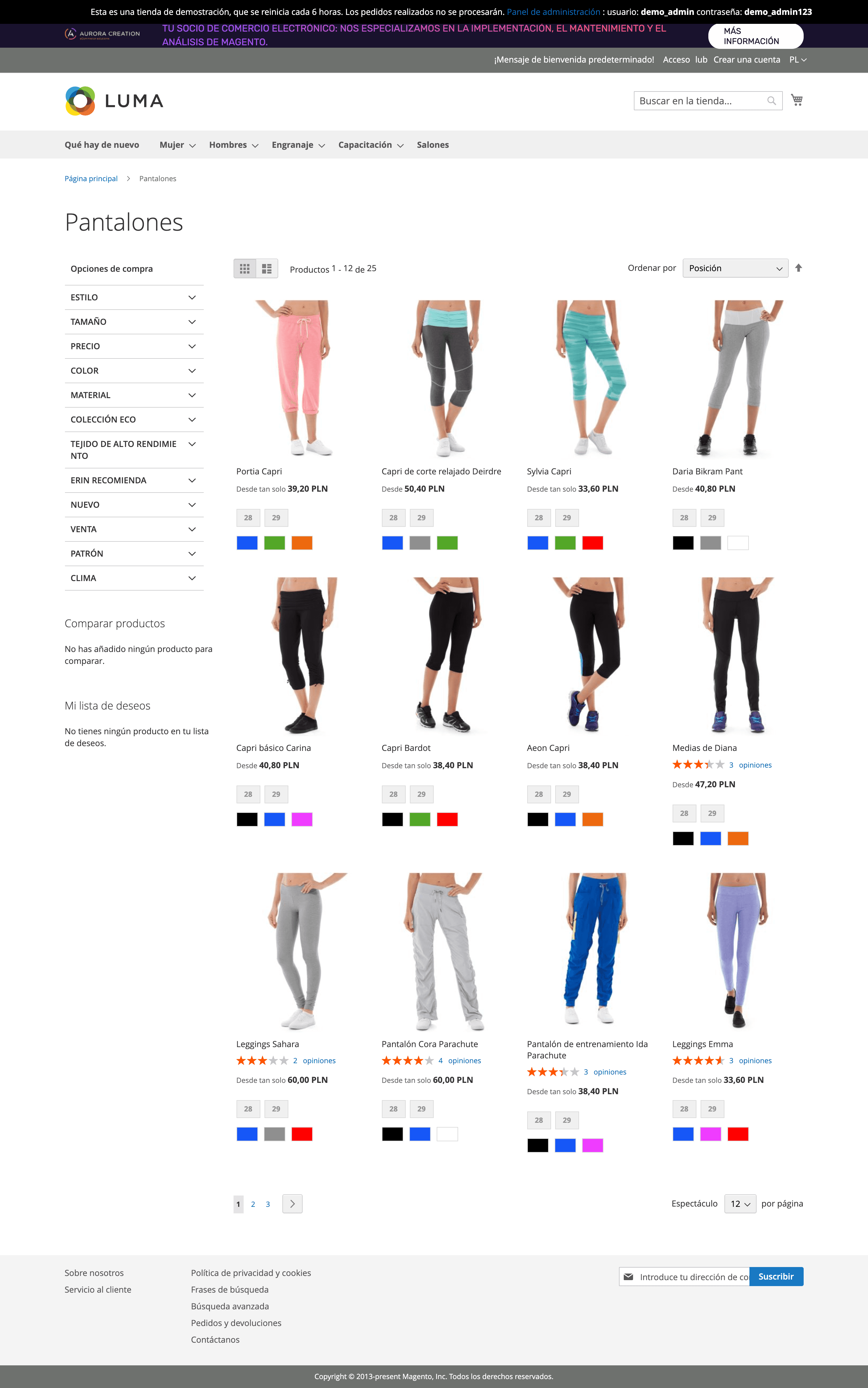
PLP (Product List Page) — Magento template
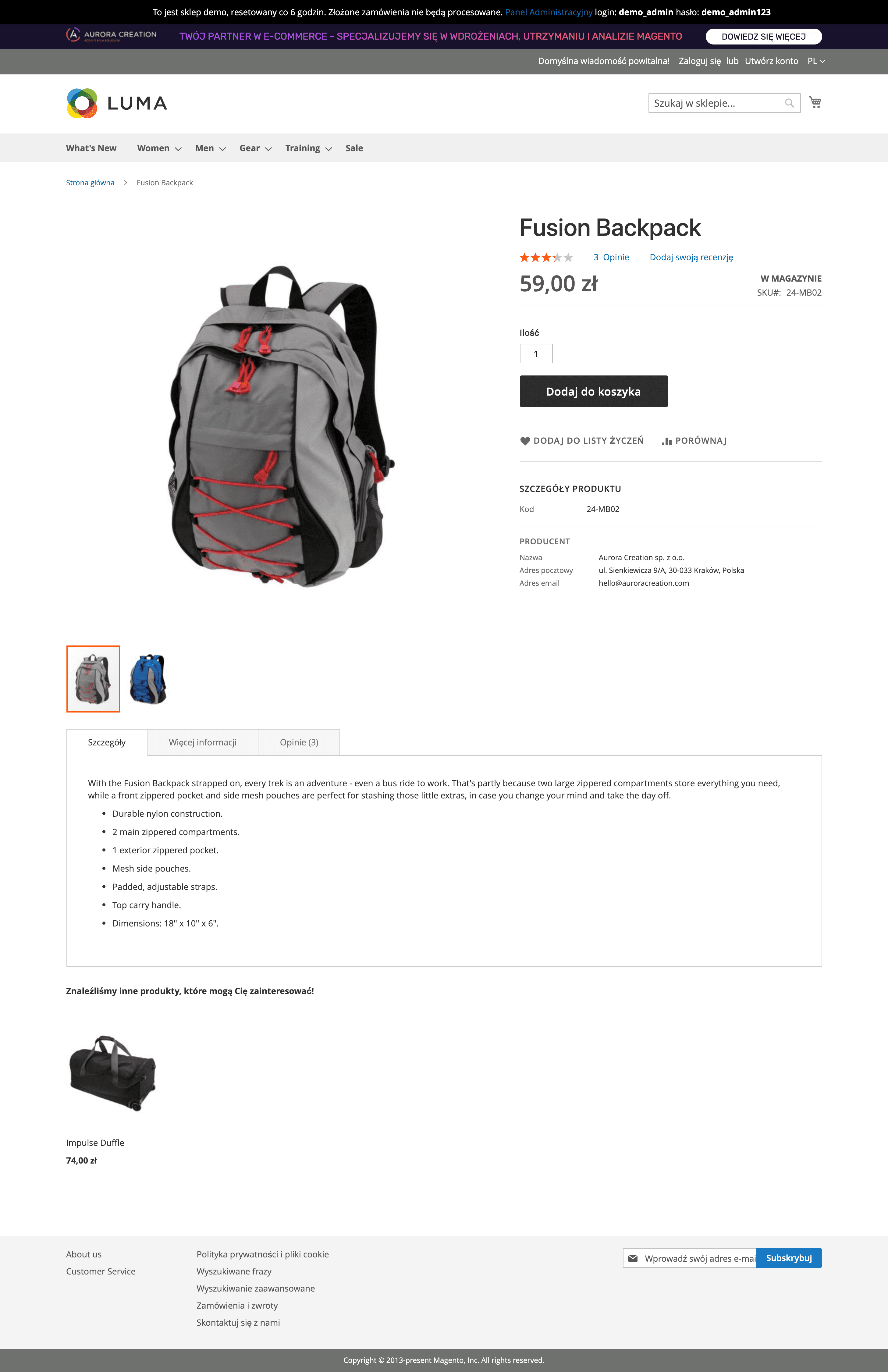
PDP (Product Detail Page) — Magento template
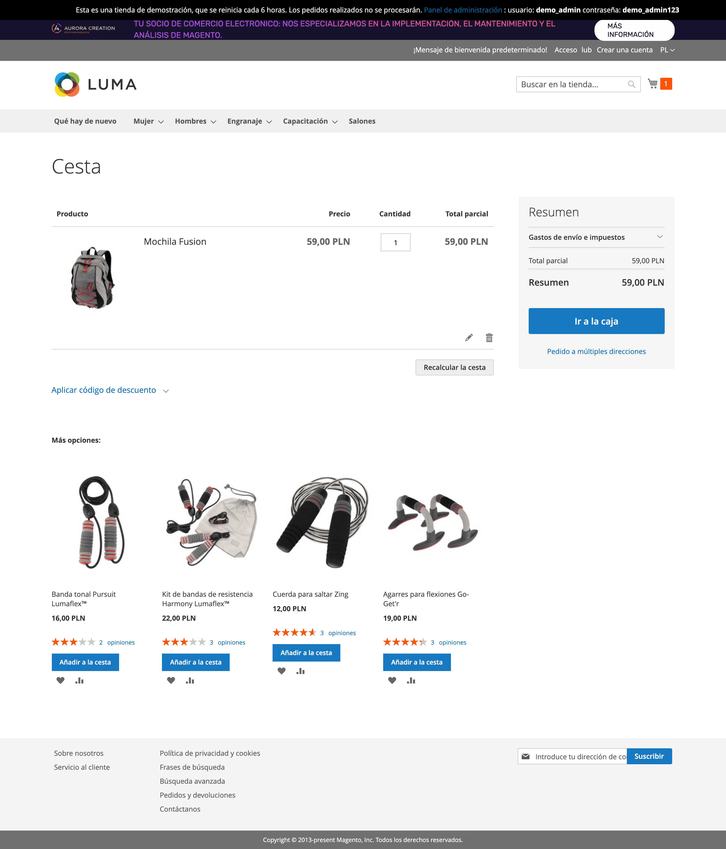
Shopping cart — Magento template
Magento and the boundaries of design
Magento (Adobe Commerce) is an open-source e-commerce platform that defines from the backend how pages, components, and interactions are structured: PLP, PDP, cart, and checkout all have predefined template architectures built on a Less-based theme system, PHP blocks, modules, and layout XML. Design can't ignore those limits: whatever is proposed has to be implementable within what the platform renders natively. That's why every component, variant, and customization was reviewed with the Magento-expert development team before moving forward.
Continuous technical validation
Every component, variant, and customization was validated with the Magento-expert technical team. The priority: no design proposal should require development outside the sprint scope or compromise delivery timelines.
Design within platform constraints
Magento defines what can be rendered natively and what requires custom PHP modules. Understanding that boundary was essential to proposing components with real technical viability, not just visual appeal.
02 - System
From atom to template: layered design
With the benchmark as a foundation, I applied Atomic Design to build the library from its smallest units. Each atom —buttons, inputs, labels— was documented with variants, booleans, text options, and, where relevant, color variables. The goal was clear: no designer should have to detach a component to adapt it, because flexibility was already built in from the design.

Library overview — documentation of all components in Figma
Component customization
Each component was configured for maximum flexibility without leaving the system: variants for the different states, booleans to show or hide elements, and editable text. The idea was to cover, from the design itself, the usual reasons someone detaches —resizing or adding options the component doesn't contemplate—, so that editing content or toggling visibility never forced breaking the link with the library.

Card component customization in Figma — variants, instances, booleans and text options
Key components documented
The mini cart and the product card are the highest-frequency components in any e-commerce. I documented each one with all its variations, from the empty state to the multiple user interaction states.

Mini Cart component documentation

Product Card component documentation
03 - Pages
From components to full pages
The built atoms and molecules assemble into full-page templates. Home, PLP, PDP, cart, administration backoffice, and wishlist were designed as reusable Figma pages, all connected to Pragma's design system and ready to customize without starting from scratch. Anyone who picks up one of these pages can adjust color, typography, and content without detaching a single component.
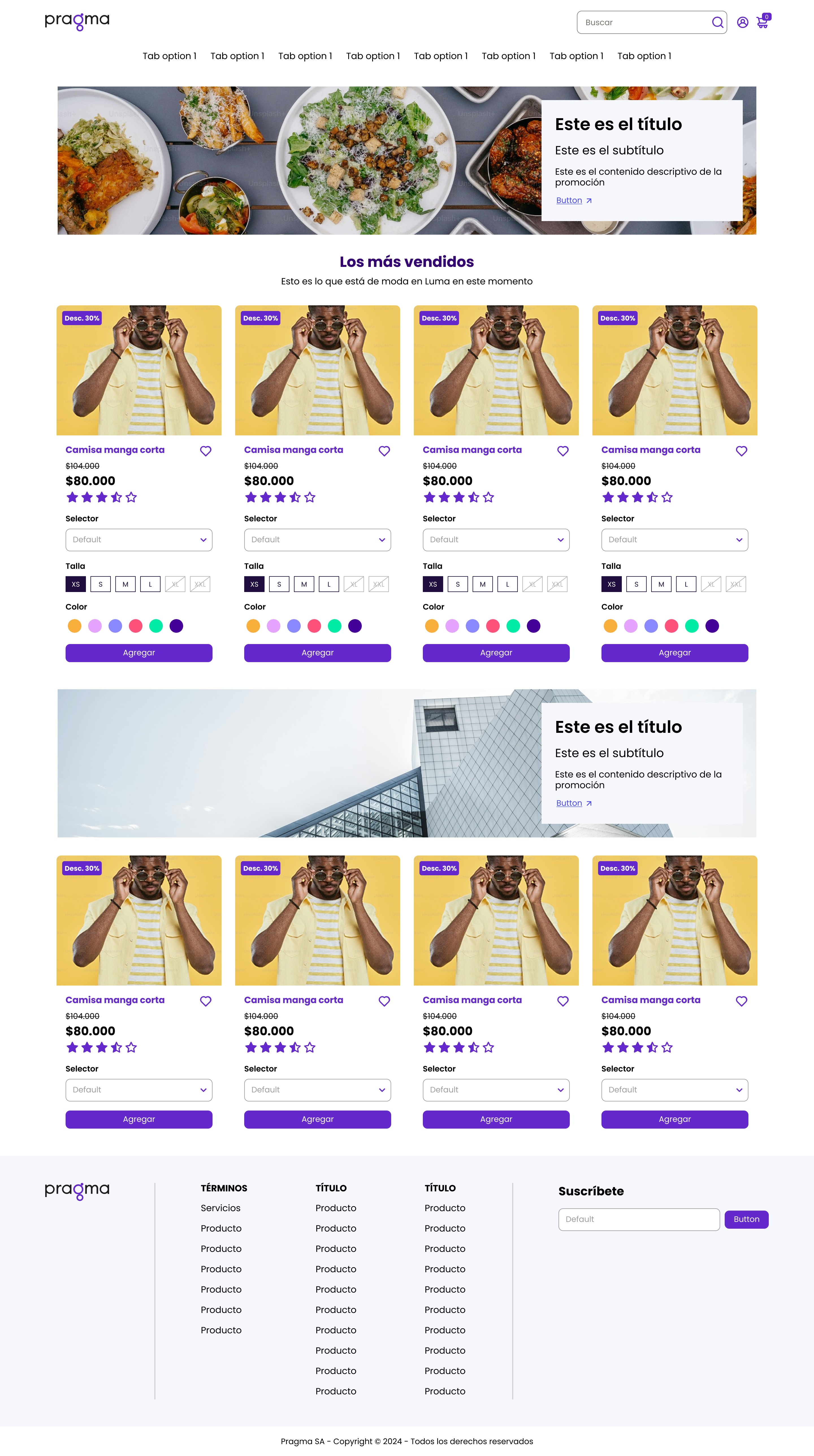
Home in atomic design — Pragma ecommerce template

PLP in atomic design — Pragma ecommerce template

Shopping cart in atomic design — Pragma ecommerce template
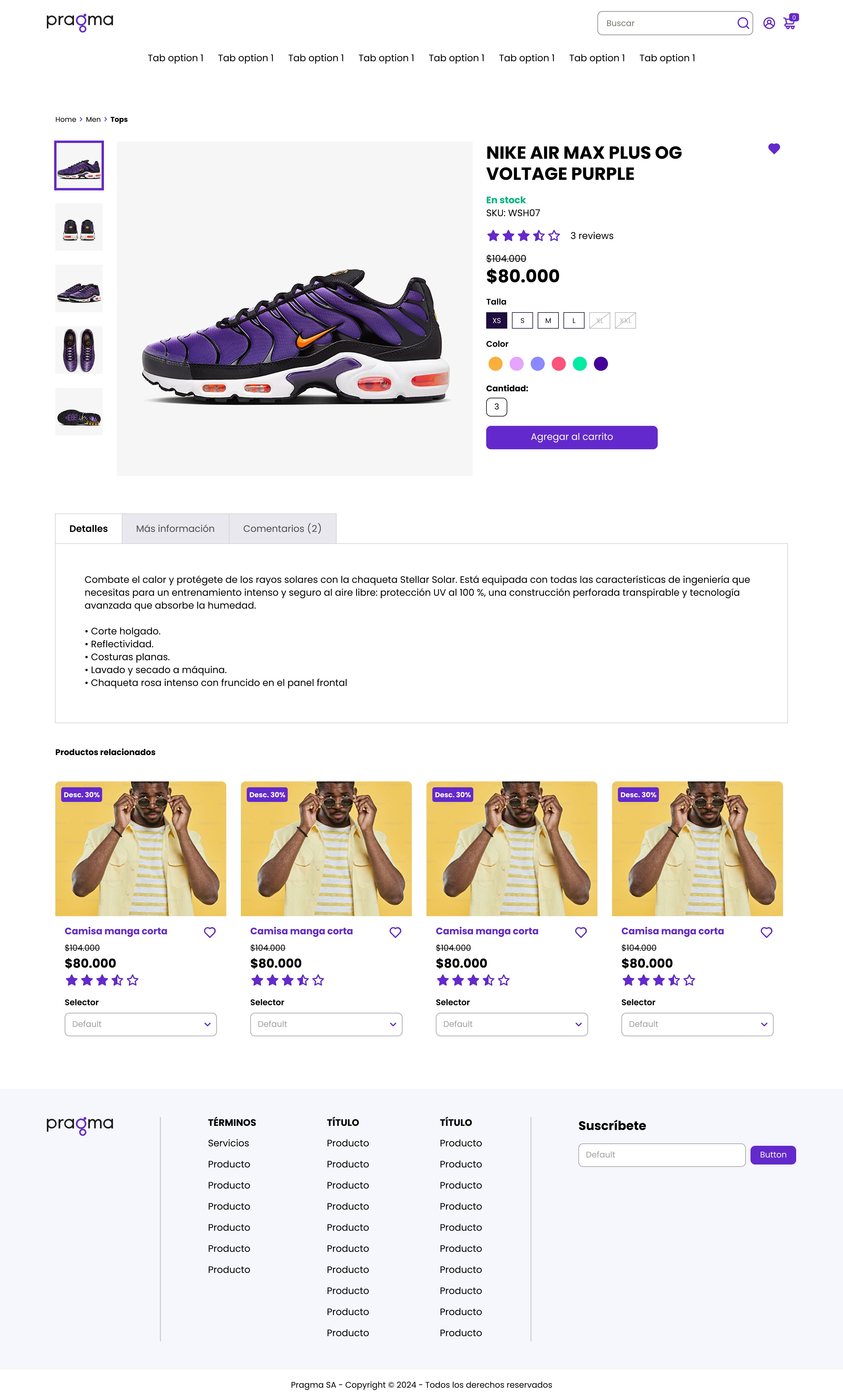
PDP in atomic design — Pragma ecommerce template
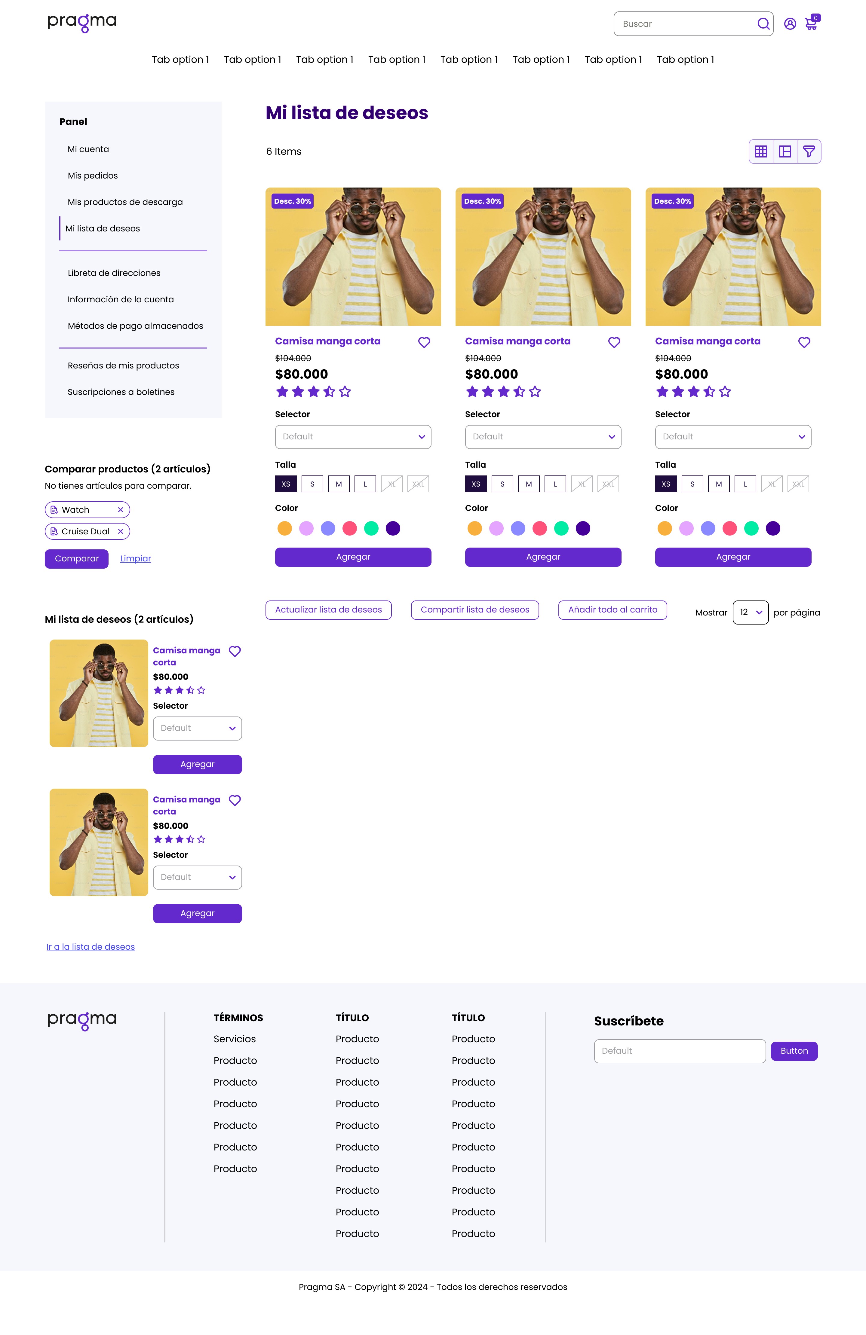
Backoffice and wishlist page in atomic design — Pragma ecommerce template
04 - Result
Organic adoption across real projects
The library was adopted organically within Pragma. Designers who used it in real projects reported —qualitatively— starting with much of the work already solved, rather than from scratch. When someone detached a component for full editing freedom, they already had almost the whole path covered: a sign the library served its purpose as a starting point, not a constraint.
A faster start
Qualitative feedback from designers who adopted it in real projects: starting from a ready base made kickoff clearly more agile than designing from scratch.
No design from scratch
No designer who used the library had to build a base component again. All the visual groundwork was already solved.
05 - Conclusions
Lessons from this project
01
A well-built system multiplies team output
Designing for other designers means thinking about flexibility, not just aesthetics. Every boolean, variant, and variable saves real hours for whoever uses the component next.
02
Detach is a symptom of a poorly designed component
If someone needs to detach a component from the system to modify it, the problem is the component, not the designer. The goal was to anticipate all possible variations from the start.
03
The benchmark defines the real scope of the system
Understanding the base platform first —in this case Magento— was what allowed us to design truly useful components. Without that context, the components would have been generic.
This library is not just visual design; it's a work infrastructure. Building it requires thinking like whoever will use it —not like the person designing it for themselves—, and that shift in perspective is, in itself, a design competency that goes beyond components.